
Lusso
Branding/packaging/website design/social media/studio photography
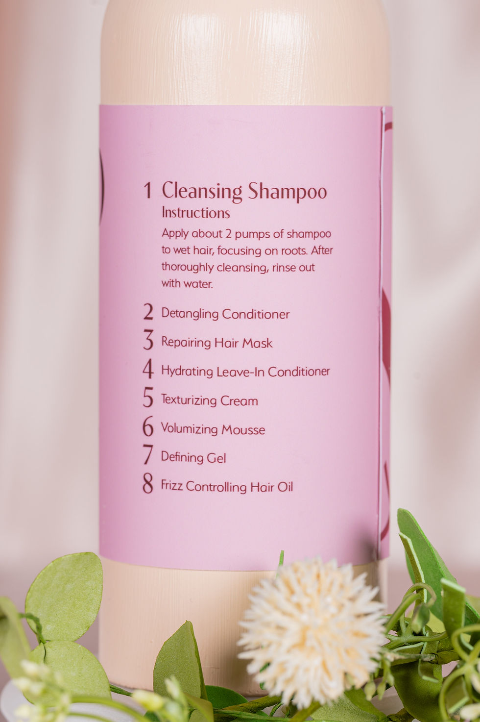
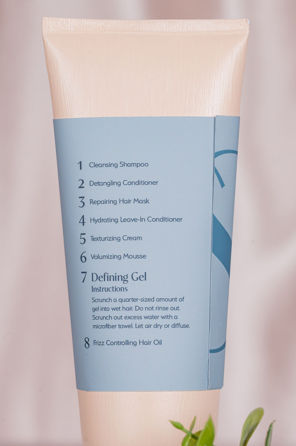
Lusso, meaning luxury in Italian, is a brand of hair products meant for women with naturally wavy to curly hair patterns that aims to streamline the curly hair process. It does so through packaging design that makes it easy to understand the correct order of the routine, what the products do, and how to apply them.
Packaging


Branding (logo, color palette, typography)

Social Media

Posters

Website Walkthrough
Click here to view full website (best if viewed on desktop)

Additional Photography


Process
I had begun developing a concept for a haircare brand long before beginning this project. I was inspired by seeing other packaging in stores when shopping for hair products, and also understanding the struggles that I have experienced, as well as what other women have gone through when it comes to hair products. I knew this would be something I would feel passionate about creating, and it would also allow me to incorporate my design and photography skills into one complex project.
Competitor Analysis
Since I have used so many different haircare brands, I kind of had an idea of what I liked and didn’t like in other hair product packaging. I analyzed three other brands and compared the strengths and weaknesses of their brand identity, packaging design, and photography styles. I also looked at aspects of the user experience like website design and also the price. This helped me to understand what I wanted to include in my design, and also what I wanted to avoid.
Moodboard
I then created an initial mood board for my photography style and some of the colors and textures I wanted to incorporate. At this point in the process, I was focused on creating a luxurious and clean feeling brand, so I was leaning towards water and silk textures, neutral colors, and minimalistic imagery.


First Logo and Branding Draft
My first logo/word mark was very plain, which is what I thought I wanted. I chose a sans serif font that had no flare or personality because I wanted the brand to feel clean and simple. I felt that less was more when it came to high-end packaging.

Packaging Draft
My main concern when first designing the packaging was that the bottles should be easy to differentiate between. One pain point I noticed when using shampoo and conditioner from the same brand was that the bottles were identical, making it hard to know which was which while in the shower. In my first design, I used my two contrasting colors to make it easy to know which was which.

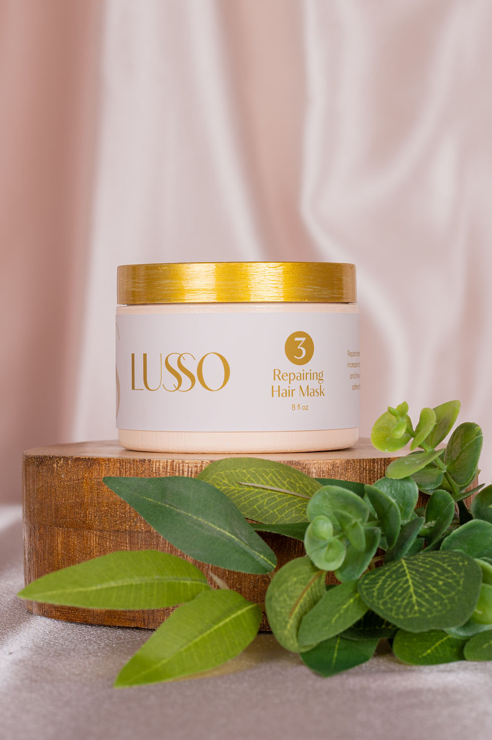
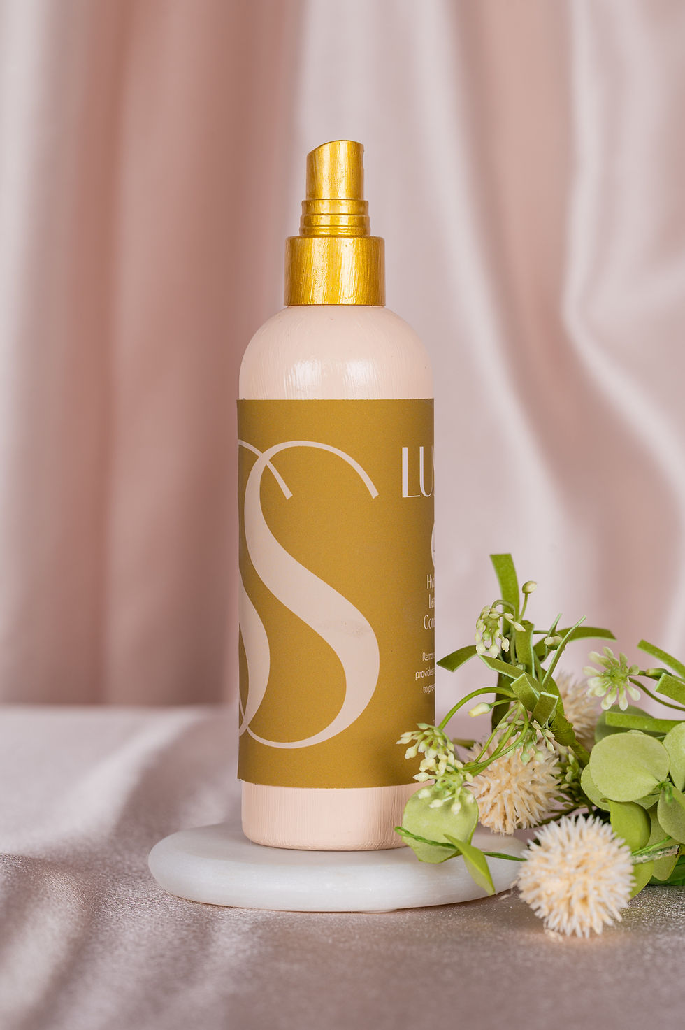
Final Logo and Branding
For my final logo, I kept the intertwined S’s, but chose a different font that combined elegance and luxury with simplicity. A critique I received on my previous logo was that the font choice was too hard to read. The new font is legible while still feeling high-end. I also revised my color palette a bit by creating more contrast between the light, medium, and dark shades of each color, making it easier to read the text and patterns on the bottles.
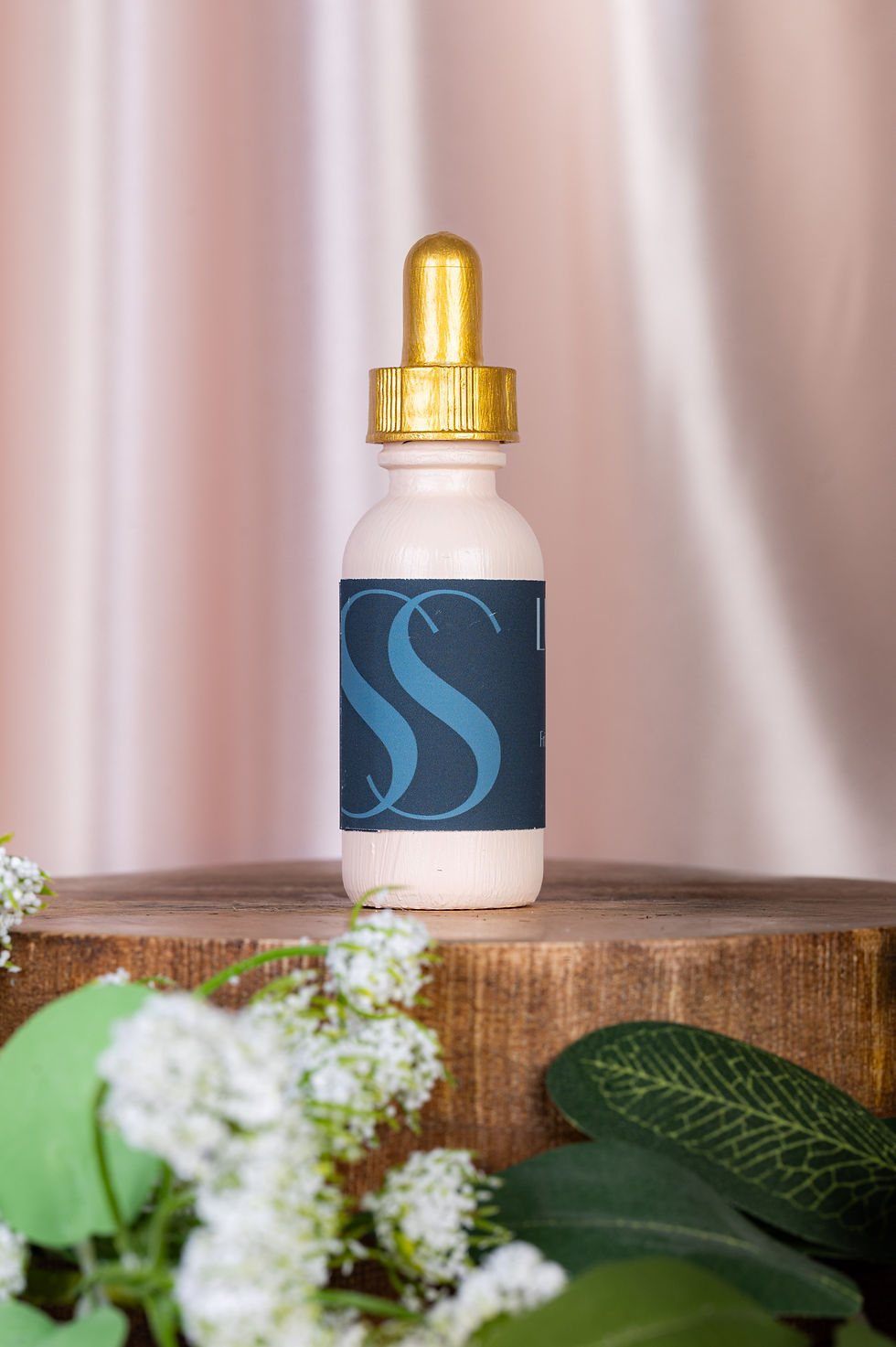
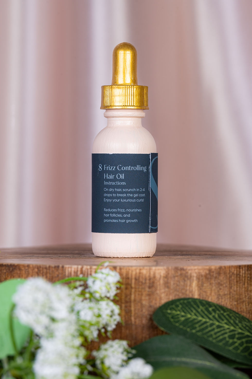
Crafting the Bottles
I started by finding bottles that fit the style that I was looking for for each type of product. Once I found a few, I began by printing labels on regular printer paper to figure out the size, layout, and color. This process helped me visualize the color palette and finalize the correct levels of contrast between each of the colors. Once I found the rest of the bottles, I was able to finish designing the rest of the labels.
With my color palette, I wanted something that felt feminine, so I leaned into a pink color palette with a contrasting accent color. I also wanted to incorporate some gold accents to add to the luxurious feeling. Overall, I wanted the packaging to feel expensive but at and affordable price.

Second Logo and Branding Draft
I revisited my logo, type, and color palette to try to make the brand identity more unique. I chose a different font with more personality for the logo/display type, and I created a completely different color palette which was inspired by The Birth of Venus by Sandro Botticelli. A critique I received was that since my brand’s name was Italian, I should lean into that more. With the logo, I wanted to keep the intertwined S’s since that seemed to be an element that was well received, especially for a curly hair brand.


The next step was deciding on the design of the actual bottles. I originally to paint the bottles to match the labels and use the cream color for the caps, but I found it difficult to match the paint colors to my color palette. I also received some feedback and found that it might be better to keep the bottles consistent, which would also help the labels stand out. I used the cream in my color palette for the bottles and went back to my original idea of using gold for the caps.


Photoshoots
I wanted all of my photos to feel cohesive and luxurious, so I decided to use the same background for all of the photos which was a satin fabric that fit my color palette. For the product photos, I did an initial shoot where I had all of the bottles standing. I was inspired by other beauty photoshoots that used risers and a few flowers to add to the environment and make the products feel elevated, feminine, and high-end. After a critique session, I realized I should do another shoot where I laid the bottles down and shot from the top down to capture more of the fabric and get even more angles of the bottles.
I did one more photoshoot where I brought in my models. I liked the look of having them hold the bottles next to their hair to showcase what the products do, but also having them on their own to highlight the models and make the customer feel like the brand is targeted for them. I also had them interact with each other to bring a sense of belonging and community to the brand. I used models with different hair types to show that the brand works for all curl patterns and hair textures and also to add more dimension to the website.


