Lion Lines Chocolate
Packaging/studio photography
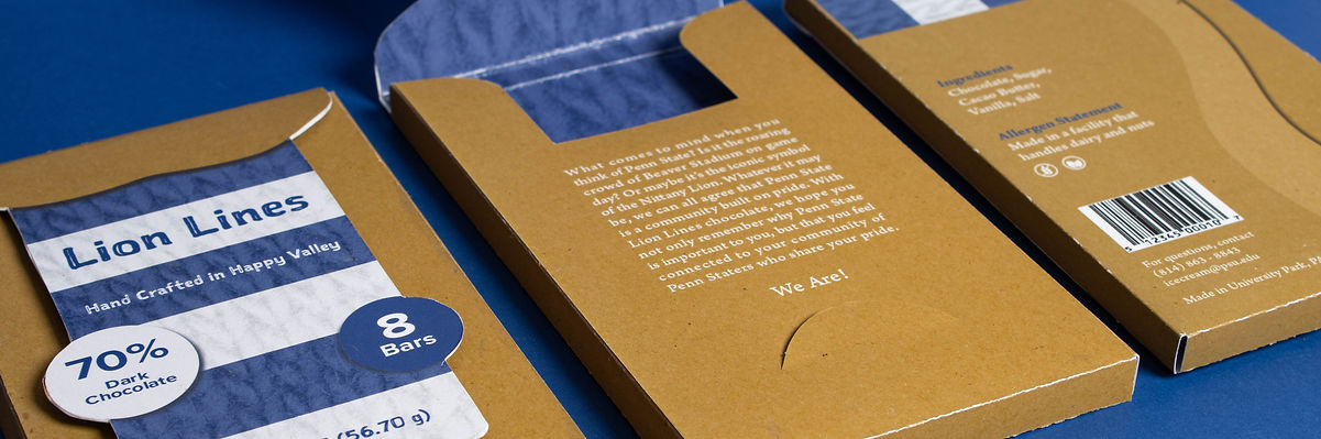
Lion Lines encapsulates the many iconic symbols and phrases that create Penn State’s culture and community. The packaging zooms in on the mascot, the Nittany Lion, and captures his striped scarf and decorative buttons. The chocolate itself is separated into eight easily breakable pieces, each decorated with a term or phrase that you might hear while at Penn State. These lines, guarded by the Nittany Lion, are shared by all of those who make Penn State a community full of pride.


Process
After receiving the brief, I tried to think of things that represented Penn State – specifically terms and phrases that could be catchy titles for a chocolate bar. While at the grocery store looking at packaging for inspiration, I came up with the name “Stripe Out” which is a theme for one of our football games where each section of the stadium wears navy or white to create a stripe pattern. I figured I could use navy and white stripes in my packaging, but I could also make the chocolate itself separated into stripes which would make it easy to break off one piece of chocolate at a time. For the chocolate mold, I wanted to include Penn State terms and phrases on each line to bring some school spirit into the actual chocolate too.
Concept Sketches
I started my process by sketching some ideas for the packaging design that involved striped patterns, textures, and interesting typography. I also tried to think of unique ways for the packaging to open so that it would be easy to access the chocolate. I was having a hard time thinking of something that was different than just putting stripes on a box. I started to think of things that you see at Penn State games that have stripes on them, and I thought of the striped overalls that students wear and the Nittany Lion mascot who wears a striped scarf. After a critique, I decided to move forward the the Lion concept. I did some more refined sketches and created a design where the user would lift the scarf to open the chocolate.


Iterations
I had my design pretty much thought out, so I worked on different layouts using the scarf and buttons to separate the information. In my first design, the title was too small, so I just made the whole box a bit bigger. I was also told that the drop shadows didn’t fit the style of my design, so I should figure out a way to incorporate some other textures. In my second design, I was still missing the texture, but I improved my layout, added the body text for my story, and redesigned the background to fill the space and strengthen the concept. In my final product, I added the texture by scanning a piece of paper for the box and a knitted scarf for the scarf.


