Bad Boy
Album design/photography
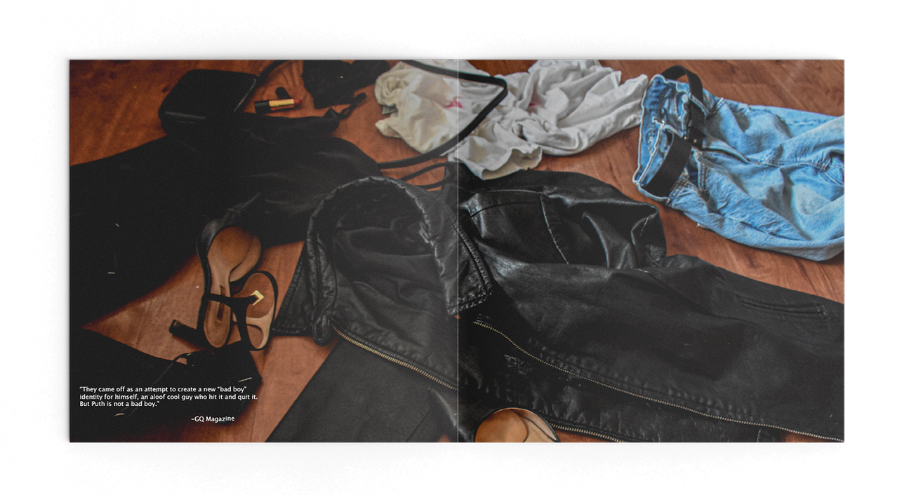
“Bad Boy” is a re-release album of previously recorded songs by Charlie Puth. The name comes from an interview with GQ magazine where Puth shares that Elton John disliked some of his songs that give Puth a “bad boy” identity that John felt is not who he really is. These particular songs, among others that fit this genre, are included on “Bad Boy” to prove Elton John wrong. The album design uses a leather jacket, lipstick writing, and disregarded clothing to further push the bad boy image.
Front Cover

Back Cover

Inside

Lyric Sheet

Record Sticker

Process
I’m very thankful that I decided to subscribe to GQ Magazine before this project because this design would not exist without it. An interview with Charlie Puth completely inspired me when creating this concept. He said that Elton John didn’t like some of his songs including “I Warned Myself” and “Mother” (which happened to be some of my favorite Charlie Puth songs). Elton John felt that they gave Puth a “bad boy” identity which he felt wasn’t like him, especially compared to his other songs (which I don’t really like). So I took the songs that I did like, put them into a track list, and made “Bad Boy.”
Moodboard
I started with a moodboard that compiled some things that I felt fit the bad boy imagery. I was really drawn to Puth’s scar on his eyebrow which seemed pretty “bad boy” to me. But since I wasn’t able to use imagery of the artist, I had to change my focus. I thought about a photoshoot with Timothee Chalamet where he wore a leather jacket, and I started to incorporate that into my concept. I thought about other things a bad boy might do, and I came up with the concept of a hook up scenario. So I added clothes thrown on the ground, women’s hands with red nails, and lipstick stains.

Photographing
I thrifted a leather jacket that I could ruin. For my experimental typographic element, I thought it would be really interesting to put the type directly onto the jacket. I considered carving the words into it and making it look rugged, but I decided to use red lip liner to write the words. This helped to tie in the lipstick stains on the white t-shirt in the lyrics sheets. In this picture on the left, I’m having my friend position her hands with red press on nails around the track list to make it look like she’s holding onto the man’s back who is wearing the jacket in the cover.

In this video, I’m photographing the scene for the interior of my album sleeve. The scene depicts clothing thrown on the floor, hinting at that the man and woman featured on the front and back covers are now at the intimate point of their night. This image includes all the elements from the album design – the jacket, the lipstick stained t-shirt, the lipstick tube that made those stains, and the jeans with the button that’s on the actual vinyl.

